ALIVE
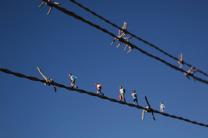
Slinkachu was born in Devon. The examples up above is in a project he captured in 2006 call 'The little people project. The name and date of which these examples were taken is unavailable. The project 'The little people.' Has a clear reason to what it's about. Though every picture is different, the little people still feature in the main bulk of the images. Maybe even of to the side using rule of thirds or with different composition techniques.
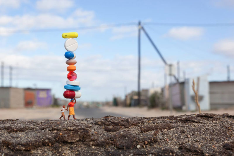
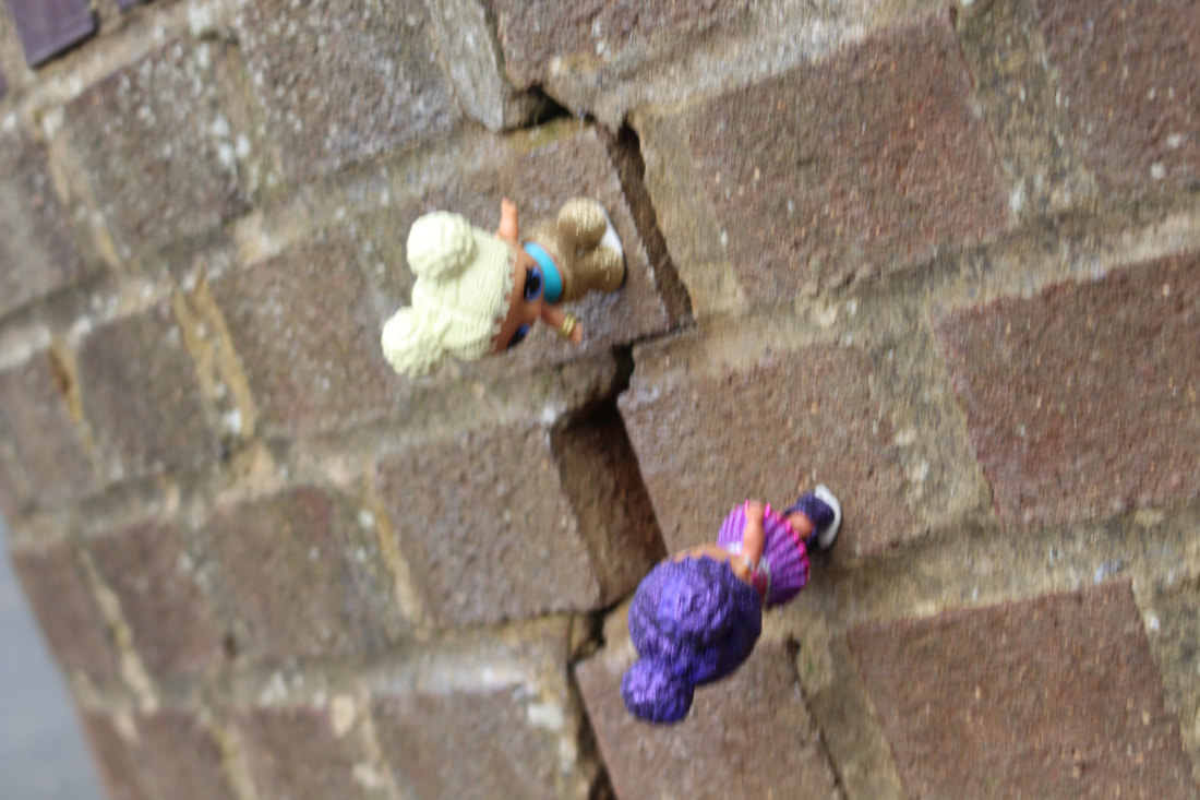
This image here, by Slinkachu is the photo I'll be focusing on for the Artist Investigation Project. Within the photograph, it is simple but conveys a huge meaning and resemblances to things. This photo shows a lady taking care of her little boy, whilst carrying everything with the other hand above her head.. It could be a resemblance of how hard the lady works, and her life struggles day in and day out; though it could also symbolize that she is carrying the world above her head. The main focus point of this image, is the little people. Whilst everything is blurred, except from them, the wall, and what the lady is carrying. Your eye could be drawn to this picture for many reasons, and one could be what kind of message it conveys. A reason I like this image by Slinkachu is because it's extremely, simple and original yet it is so bold. One type of composition rule he has used is the rules of thirds. Slinkachu had used the natural lighting of the day to light the image. The little people in the image you can read their body language but not their facial expression.
Throughout this course we have been given a chance to add on coursework we may have missed. For me, I thought that it would be good to revisit some of my writing a year later and date it here, which will further show my improvement within this course. However, on saying this, i am going to leave my year ten coursework due to the reasoning my writing has improved. So below is a short write up continuing from my artist investigation - Slinkachu.
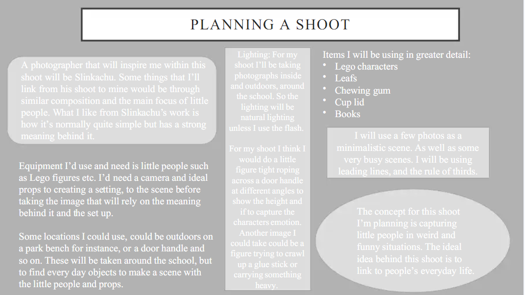
I noticed within this artist investigation I never mentioned how i would use colours, textures and camera techniques along side using Slinkachu below. S0 this is a short write up about what i am planned to do, just written in greater detail. I am going to use Slinkachu as my inspiration as i think this is a great photographer to convert messages and meanings within their images. So my main thing i want to experiment with is creating a still life using objects and props so it tells a story and i think within the shoot below i successfully did that. I also will be using Slinkachu for other relations such as experimenting within my manual camera settings with the ISO, focus and zoom. Moreover, i will use a wide differentiation of perspectives and angles to make the image more visually interesting and to intice the audience in too actually inferring the image. Just like Slinkachu i am planning to use bold and precise colours to create power, depth and in a way create more dimension such as using contrasting colours, harmonizing colours.
Throughout this course we have been given a chance to add on coursework we may have missed. For me, I thought that it would be good to revisit some of my writing a year later and date it here, which will further show my improvement within this course. However, on saying this, i am going to leave my year ten coursework due to the reasoning my writing has improved. So below is a short write up continuing from my artist investigation - Slinkachu.
I noticed within this artist investigation I never mentioned how i would use colours, textures and camera techniques along side using Slinkachu below. S0 this is a short write up about what i am planned to do, just written in greater detail. I am going to use Slinkachu as my inspiration as i think this is a great photographer to convert messages and meanings within their images. So my main thing i want to experiment with is creating a still life using objects and props so it tells a story and i think within the shoot below i successfully did that. I also will be using Slinkachu for other relations such as experimenting within my manual camera settings with the ISO, focus and zoom. Moreover, i will use a wide differentiation of perspectives and angles to make the image more visually interesting and to intice the audience in too actually inferring the image. Just like Slinkachu i am planning to use bold and precise colours to create power, depth and in a way create more dimension such as using contrasting colours, harmonizing colours.
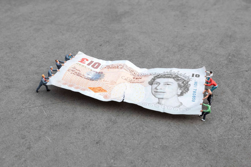
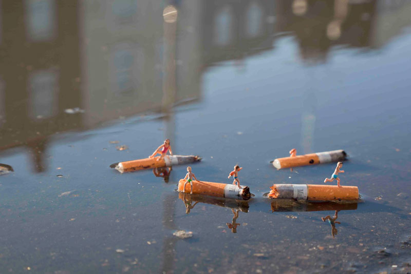
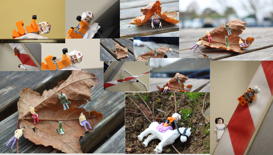
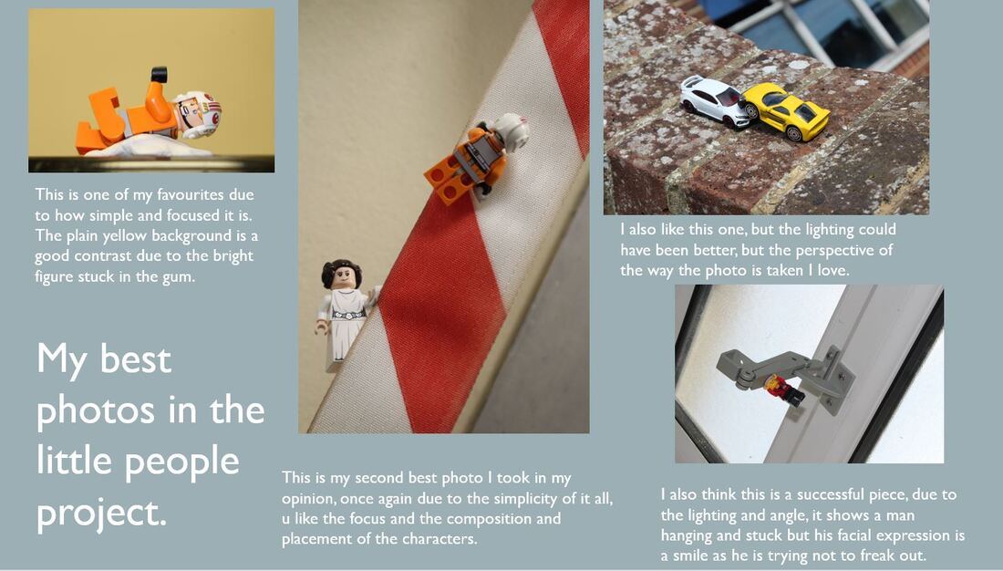
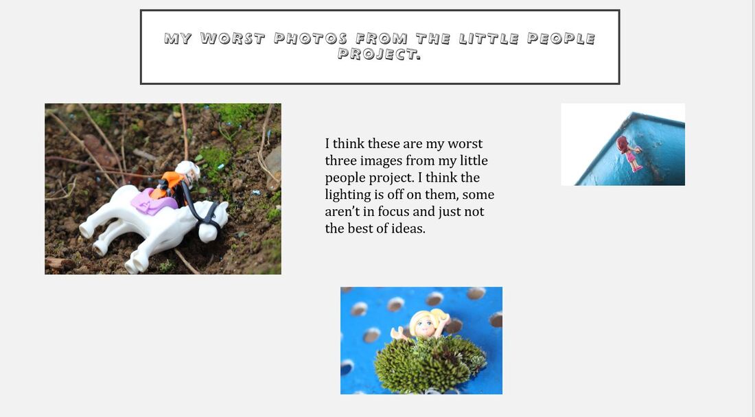
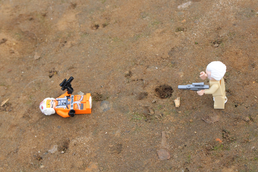
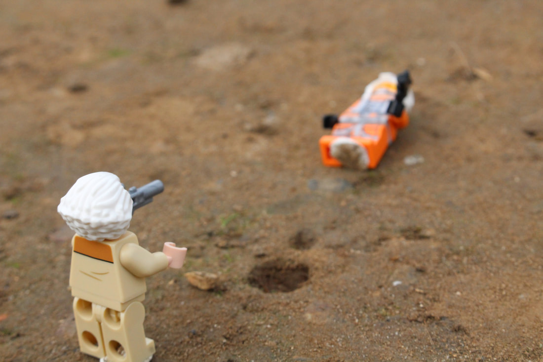
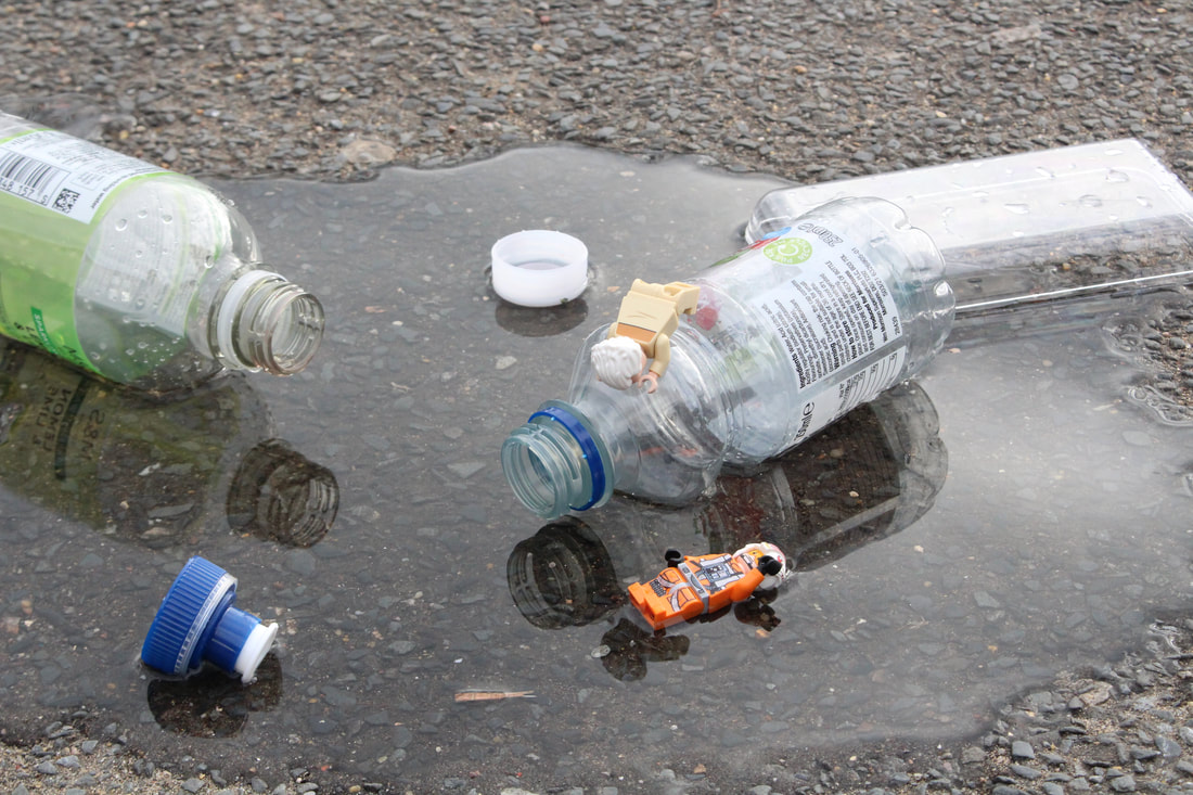
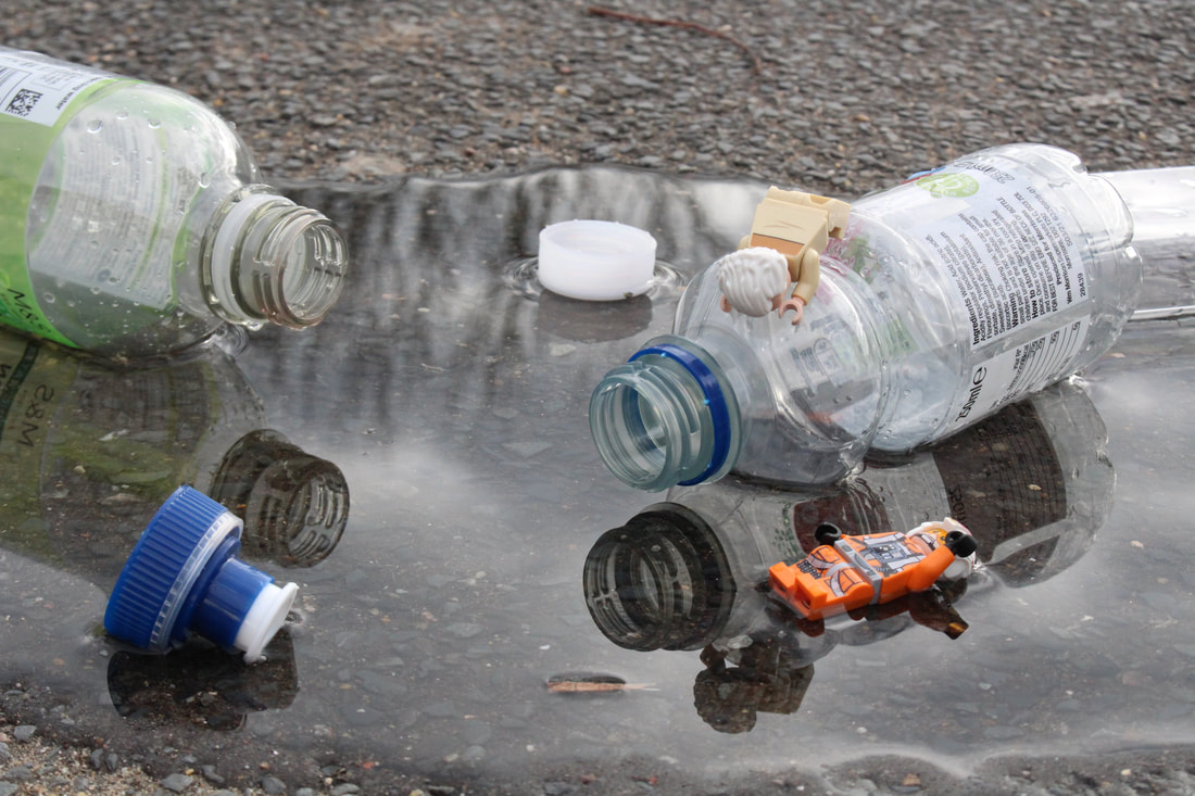
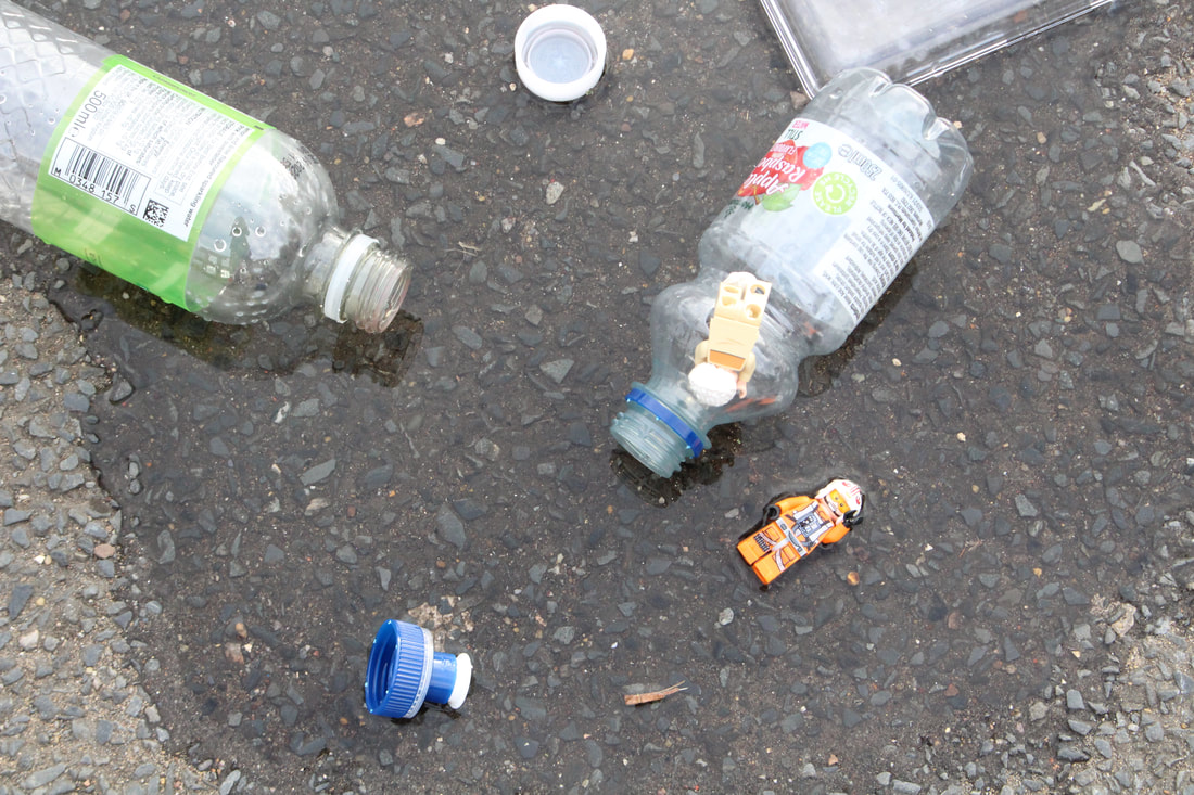
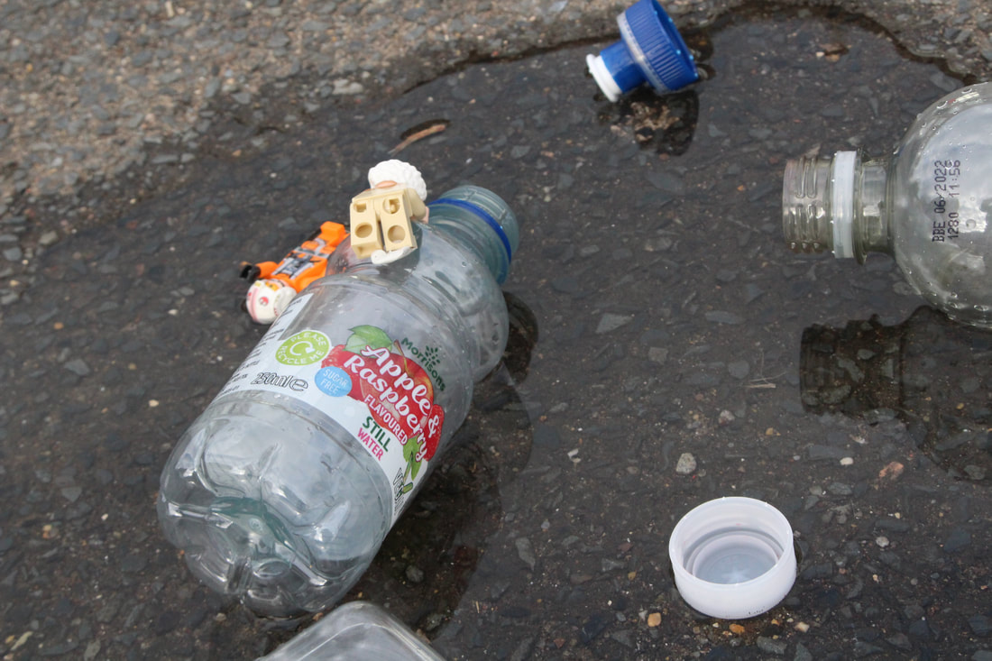
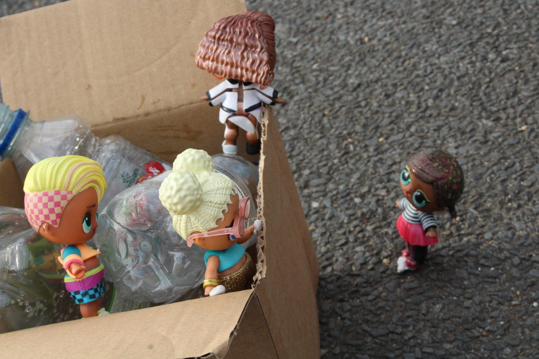
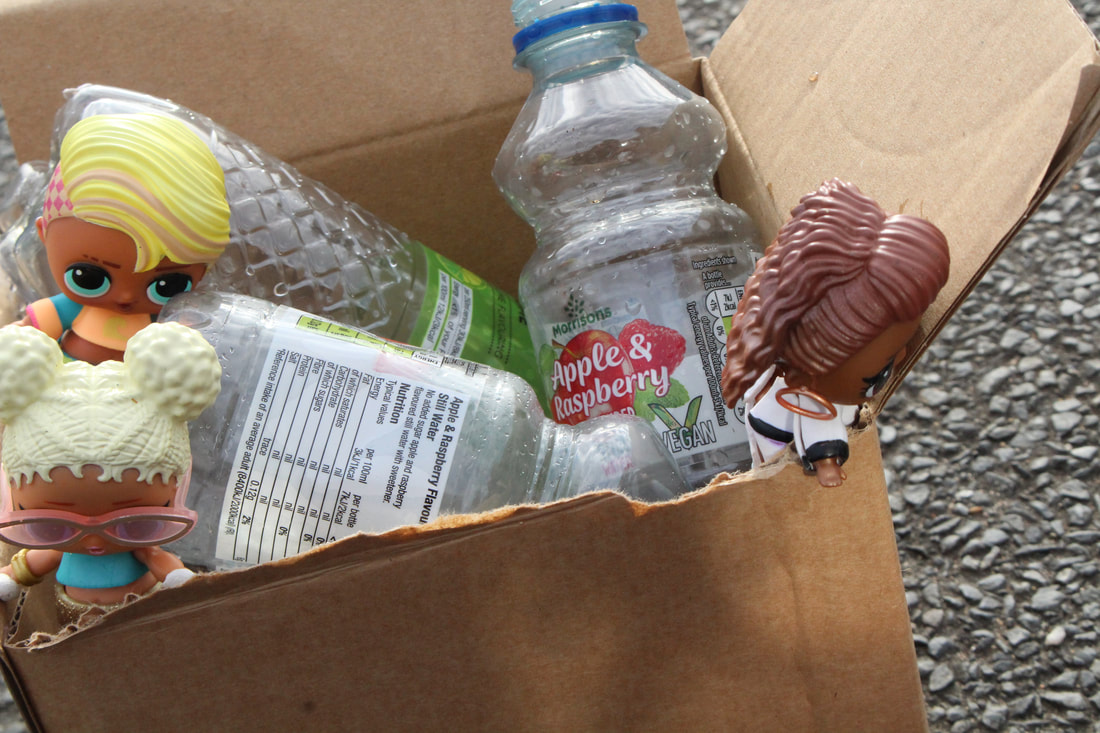
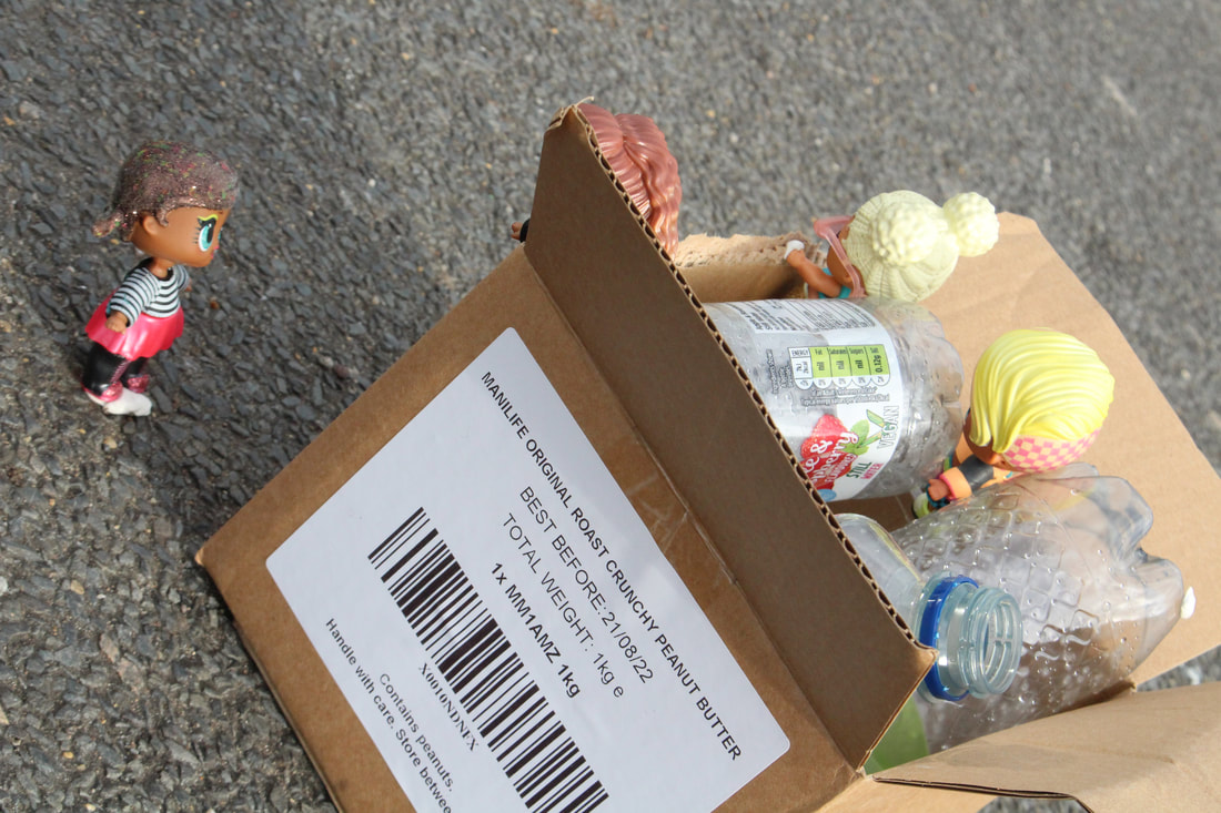
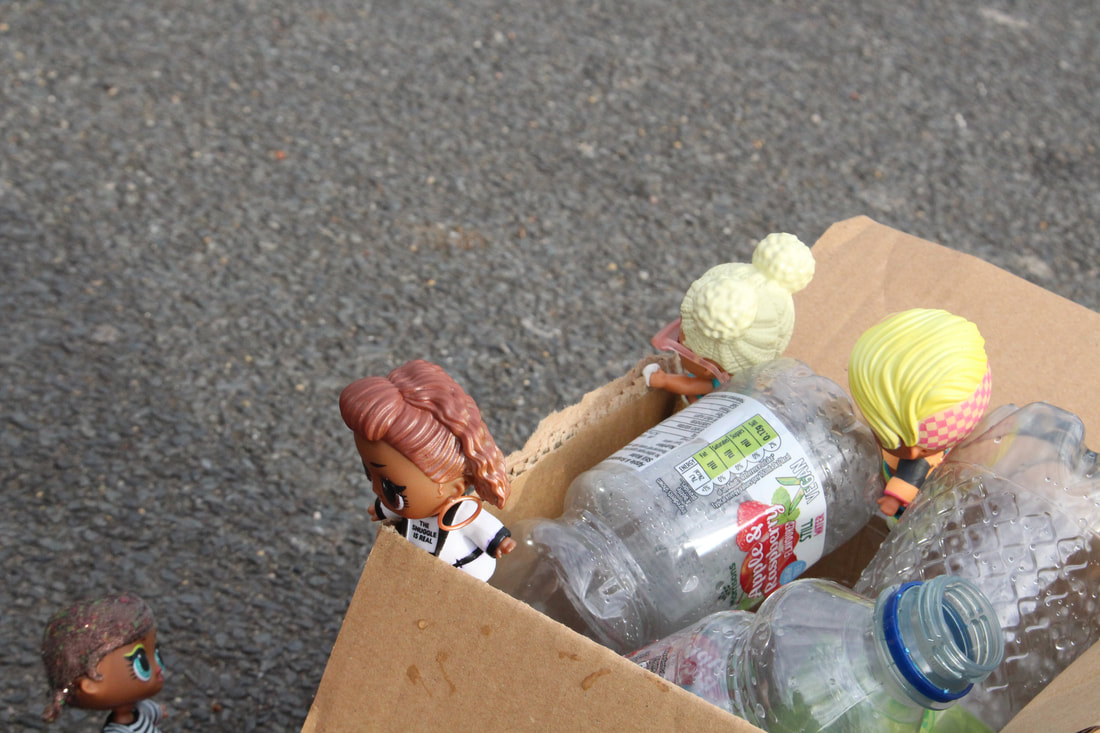
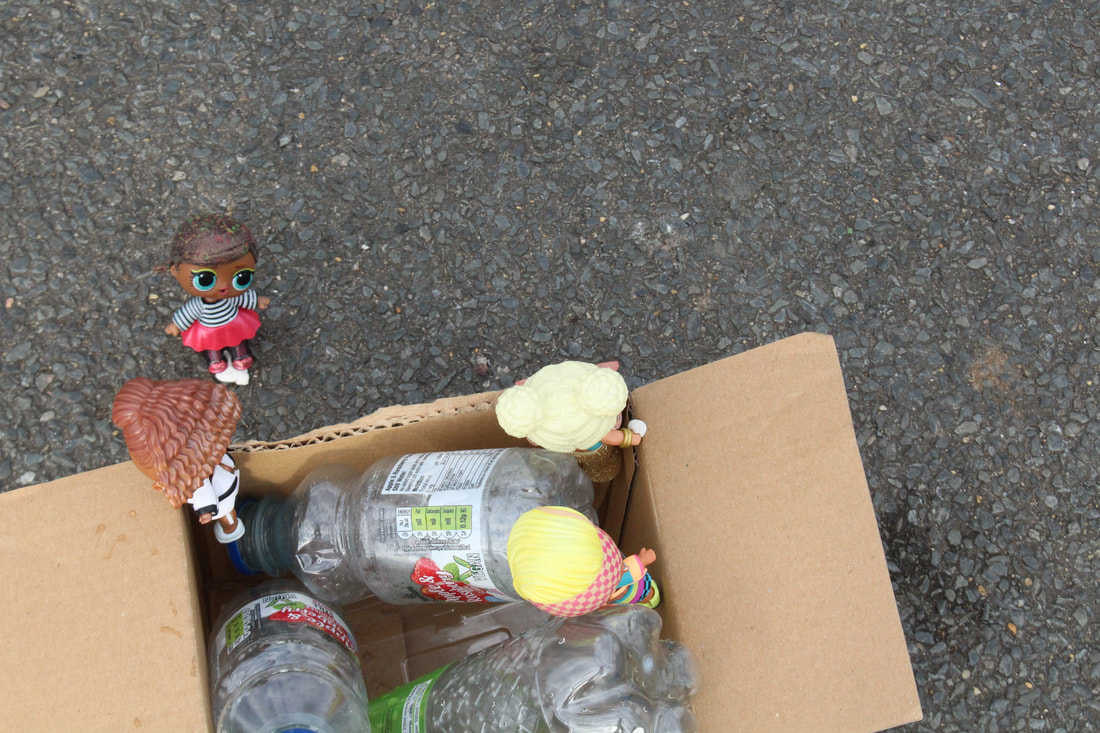
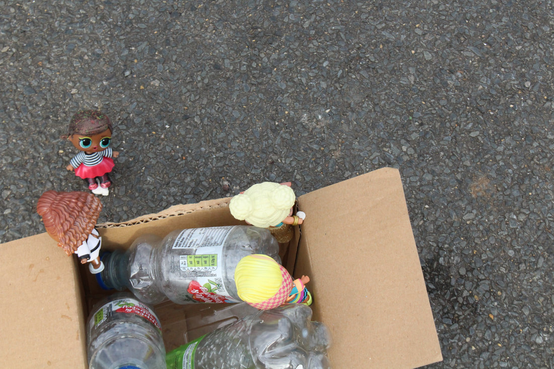
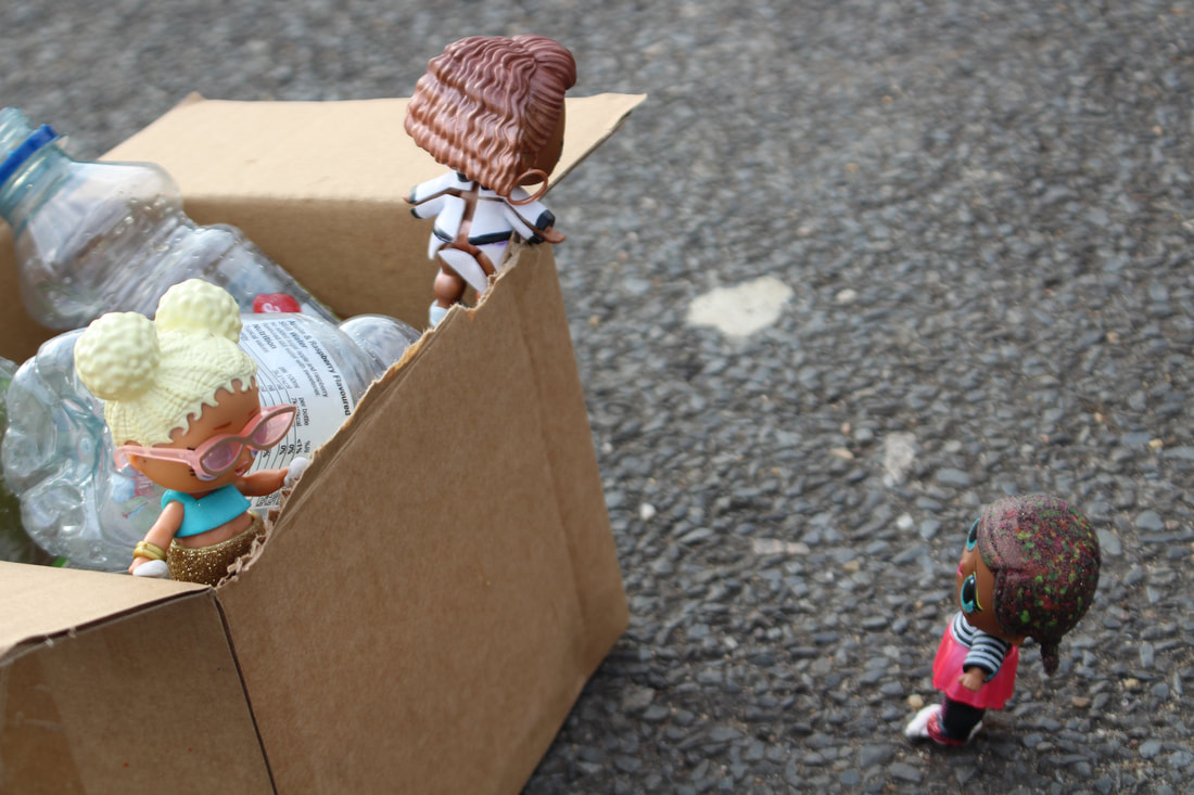
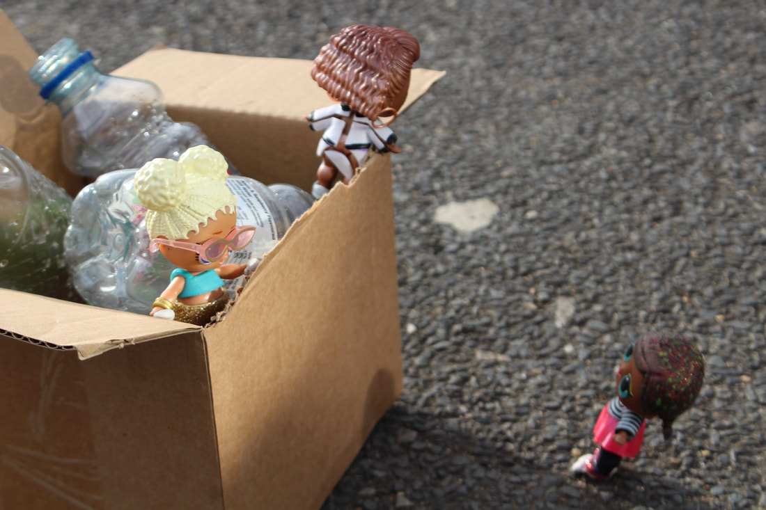
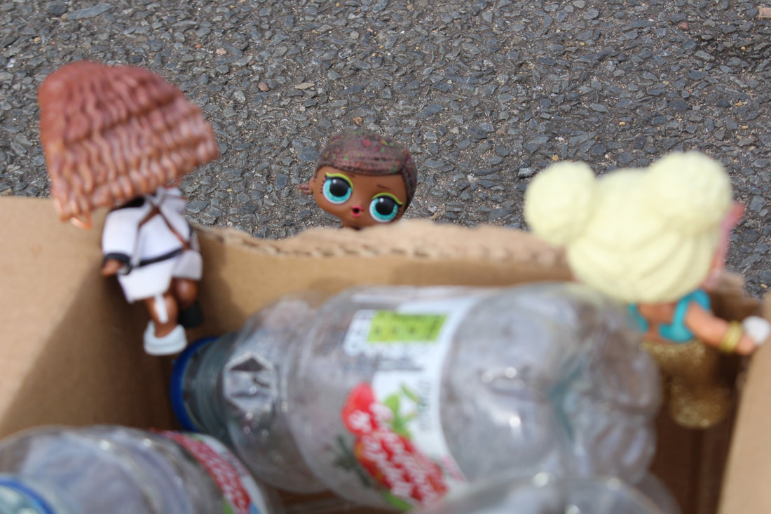
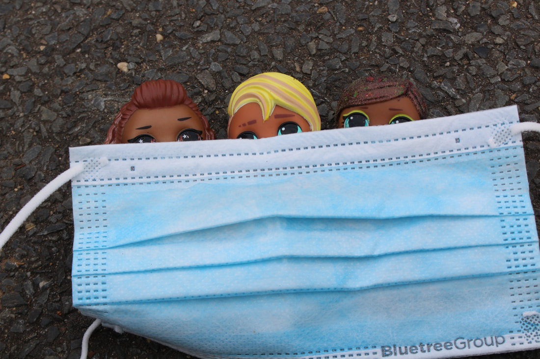
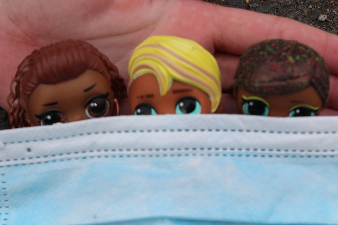
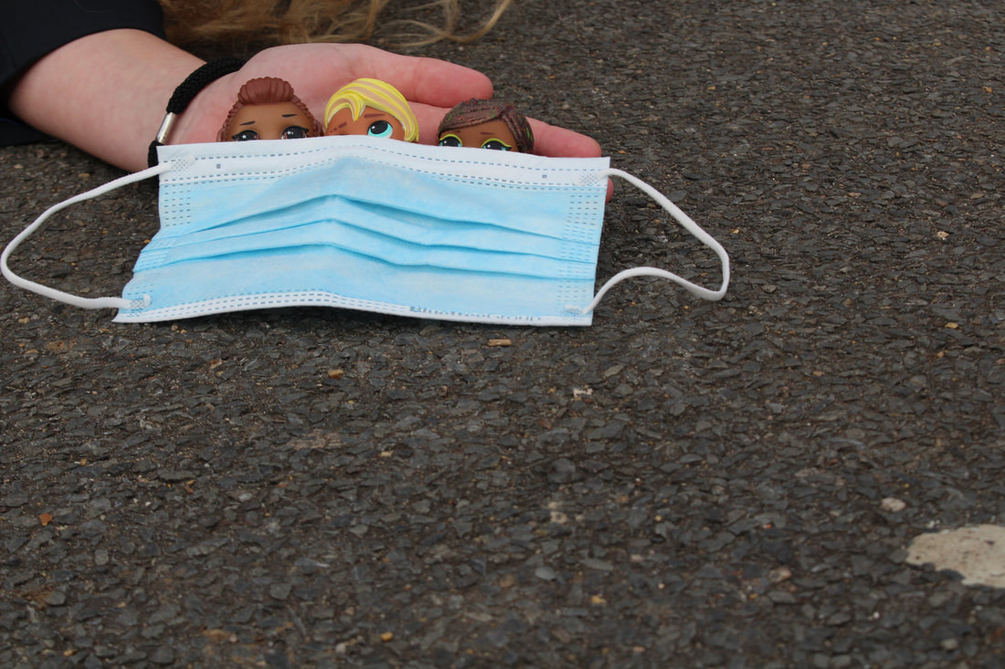
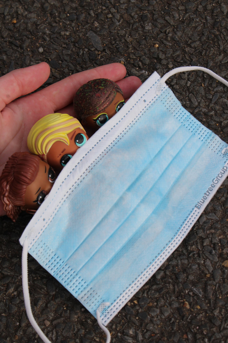
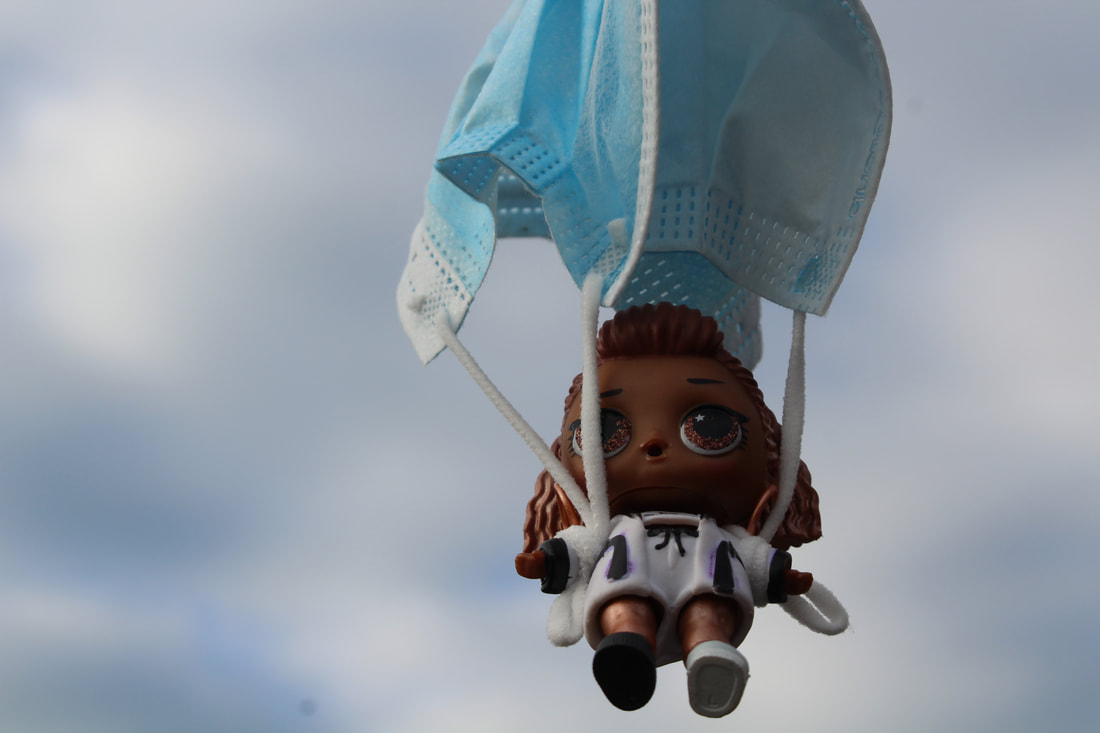
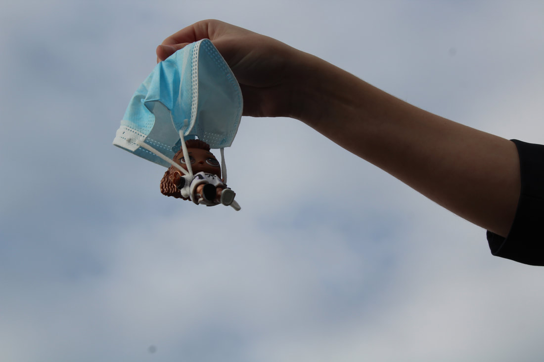
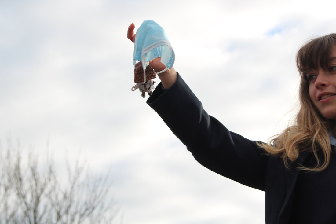
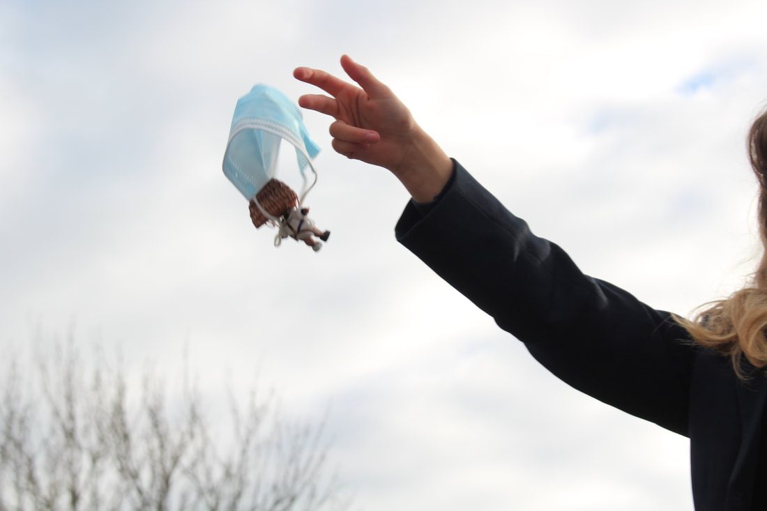
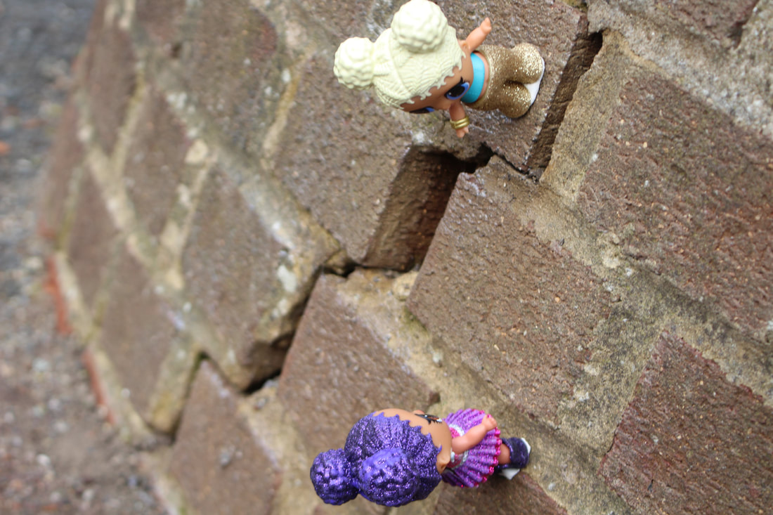
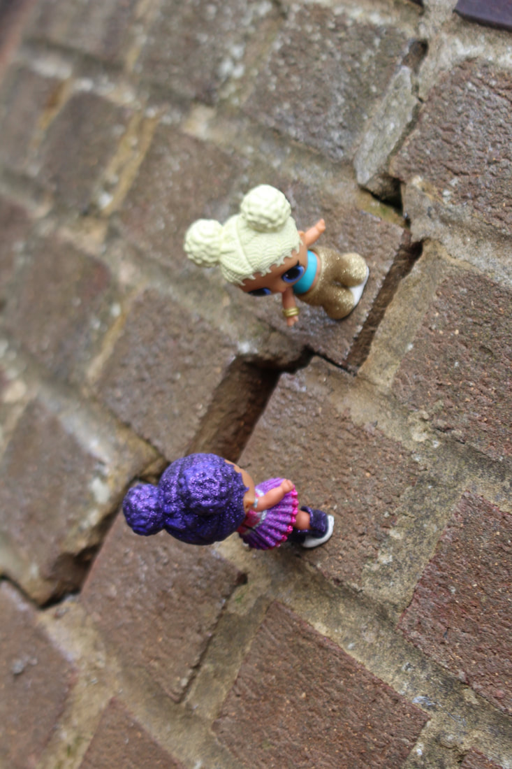
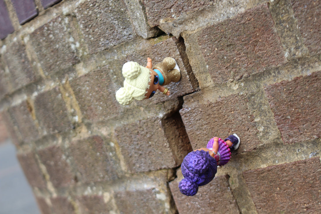
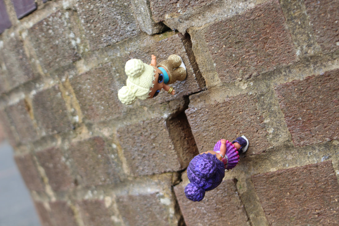
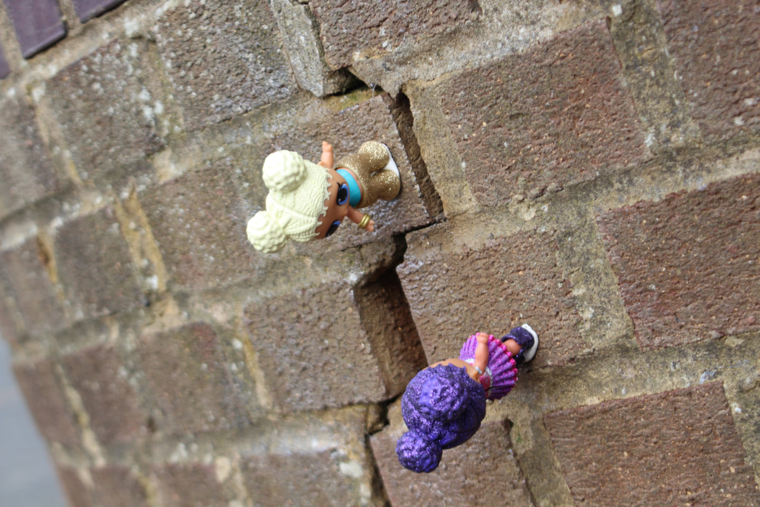
This is my little people project!
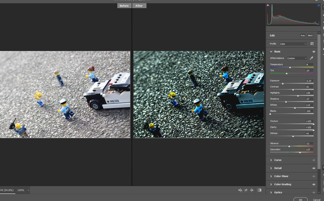
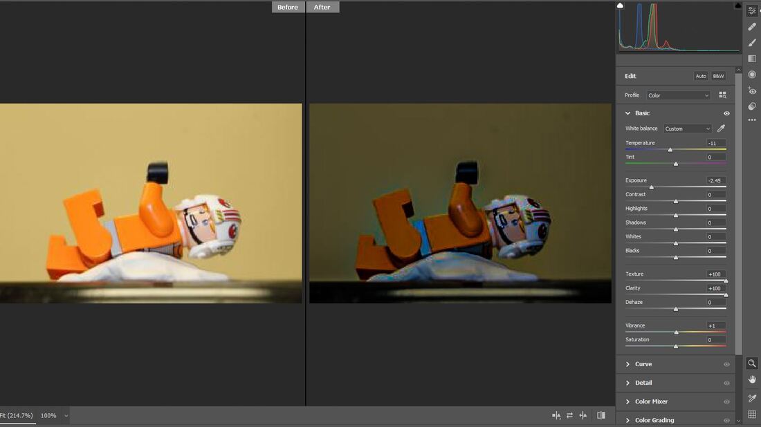
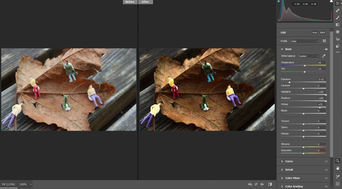
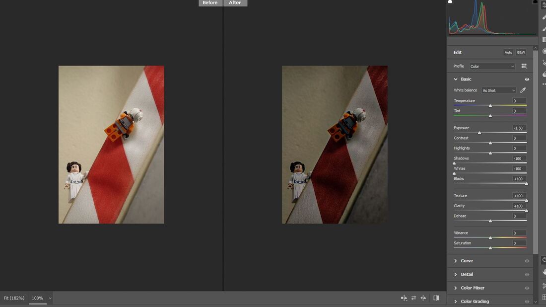
We then went onto photoshop one of our photos we took here is one of mine that I edited. Here is my before and after edit of my police scene picture.
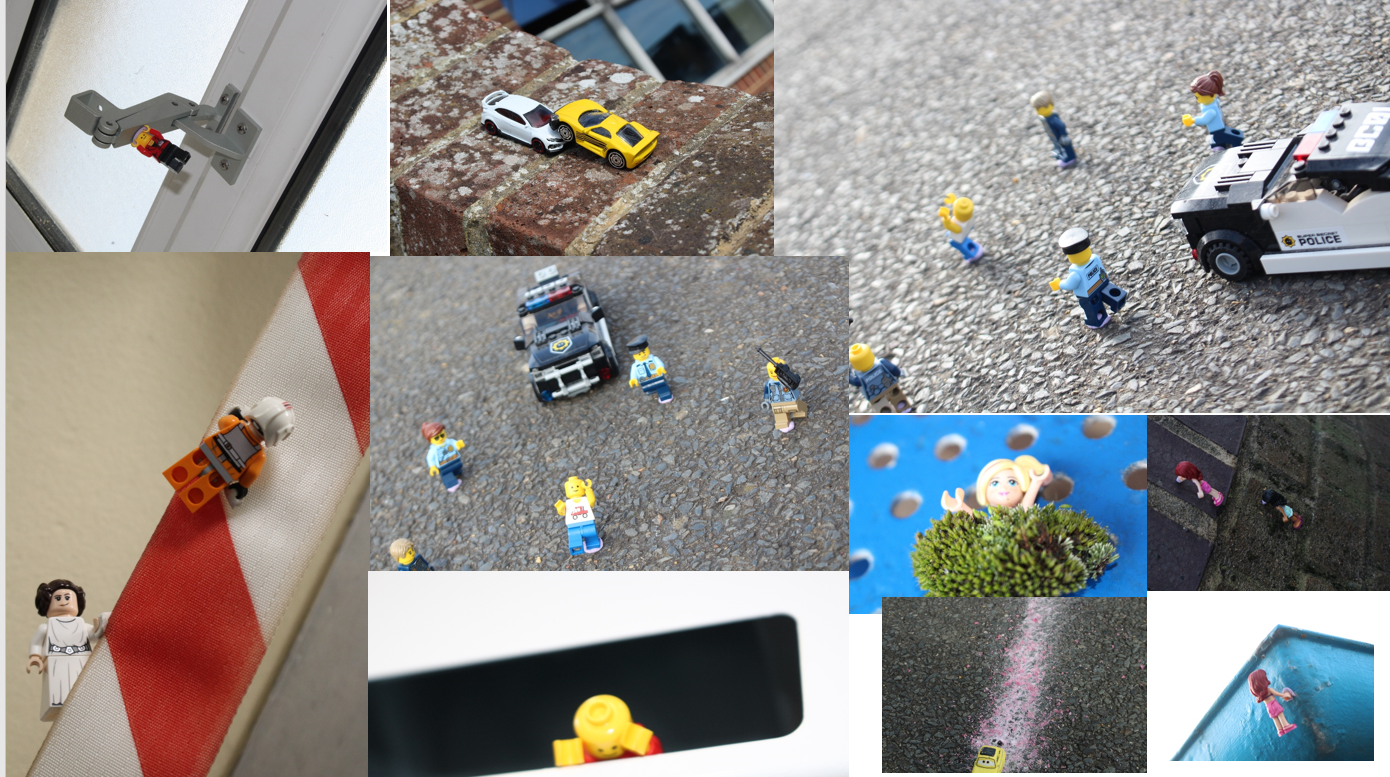
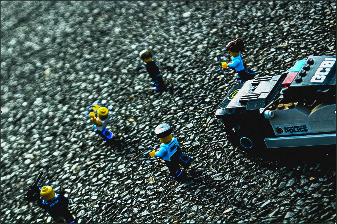
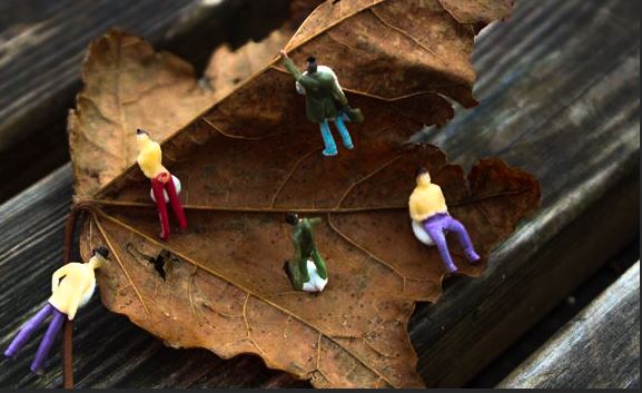
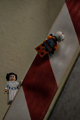
Final edited outcomes in the style of Slinkachu.
Evaluation:
My work is similar to Slinkachu's because I have used little people to tell a story and set a scene within my images I have taken. I believe most of my work has been successful due to my final outcome coming out better than I expected. Although, few did not turn out how I imagined. Some techniques I have used could be, angles and perspective and composition. I have managed to edit the four photos above on Photoshop using the raw camera filter. I've made most of my final edits more dark and gloomy because I think it sets the scene more than lighter ones would. I also think that it looks better because in all images the characters find themselves in a spot of trouble.
Throughout this course we have been given a chance to add on coursework we may have missed. For me, I thought that it would be good to revisit some of my writing a year later and date it here, which will further show my improvement within this course. However, on saying this, i am going to leave my year ten coursework due to the reasoning my writing has improved. So below is a short extended write up on my conclusion.
I believe this some of these images are extremley successful as it tells a story, i have used lighting, focus, and multiple camera angles and perspectives to create depth and dimension within my shoot. I have edited these images in photoshop on camera raw filter, which i believe links in extremley well to my artist investigation on Slinkachu. Finally, i am happy with the composition of my props, but one further way i could improve even my favorite photos is try and hide the blue tack holding my props into position more successfully. But all-rounded i believe this was a really good shoot as it will capture the audience and they can infer many messages and meanings hidden within the shoot.
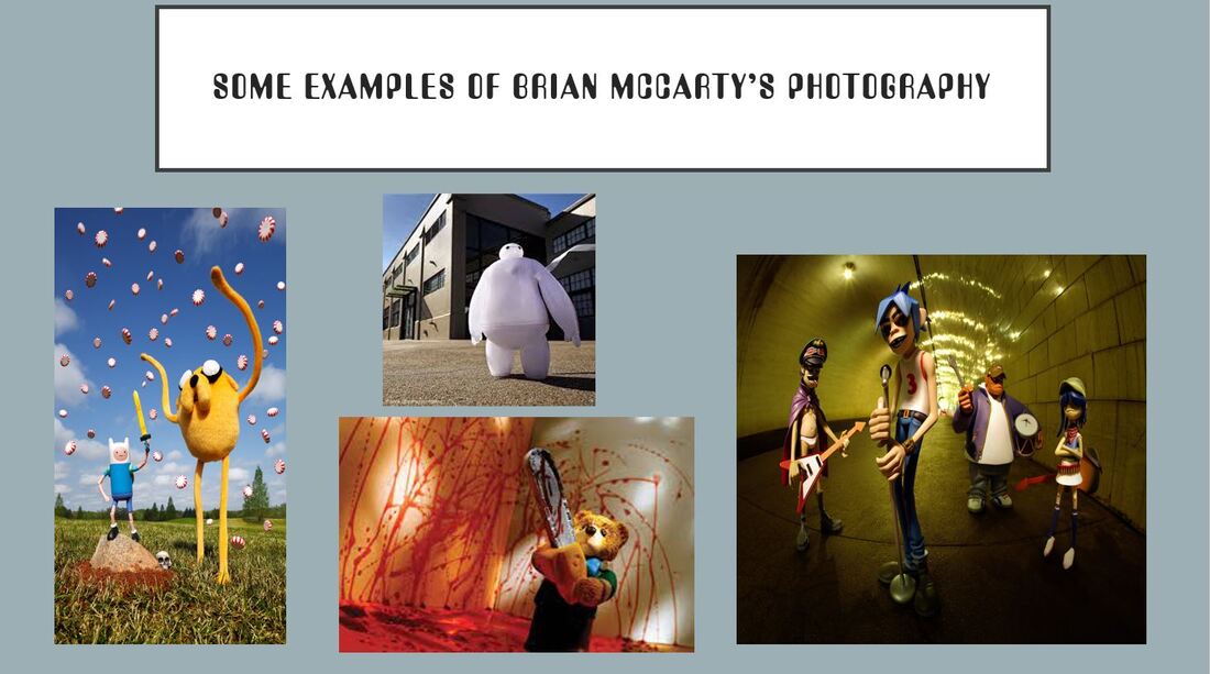
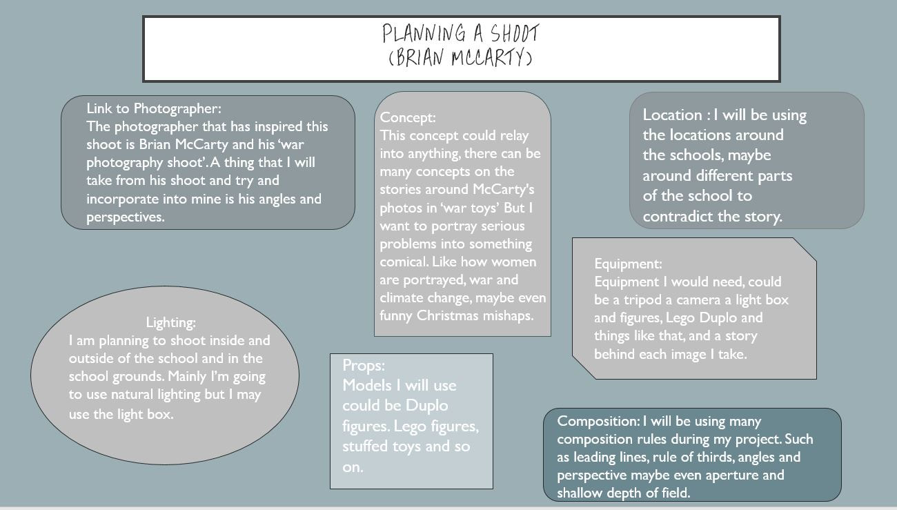
Artist Investigation : Brian McCarty
Artist investigation
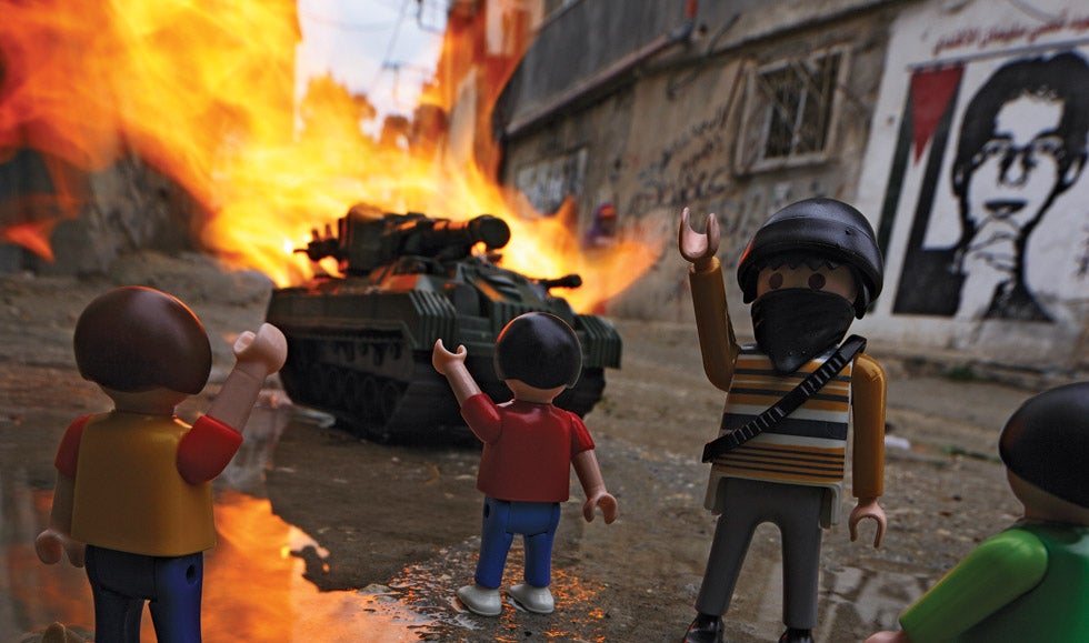
This artist investigation is about Brian McCarty, who was born in Memphis Tennessee united states, the project we are studying of his in named 'War Toys' that came around about 2012. This project has a similarity to one of Slinkachu's project 'Little people.' In my opinion this series is about 'war toys' which shows above is toy people and other props, shown as in a way life-size. He manages to do this by many techniques such as angles and perspective. This photograph is titled as 'Youth Resistance.' This photograph shows a Lego tank being blown up and in flames, you eyes focus on many things, such as the bright colour of the fire. As well as the people in the front of your veiw in a way celebrating. The thing I like about this image is how simple it is but yet it fills the frame. I like the composition and how the characters and scene is set. McCarty has set up the camera as close as the floor as possible to make the people look bigger than they are, this is the use of angles and perspective I was talking about earlier on.
Throughout this course we have been given a chance to add on coursework we may have missed. For me, I thought that it would be good to revisit some of my writing a year later and date it here, which will further show my improvement within this course. However, on saying this, i am going to leave my year ten coursework due to the reasoning my writing has improved. So below is a short write up continuing from my artist investigation - Brian McCarty.
Above i mentioned all the things Brian McCarty has done to create successful images and there are many techniques he used to create his final pieces, but i wanted to write about the techniques he use a wide range of angles and perspectives to make the basics of each image varied and more visually interesting. He uses great composition skills when he sets his props out so the image can tell a story which i think is a really effective skill and will be something i will try and experiment with. He used the set up with bold and strong contrasting colours making the image hard to look away from. So within my shoot, i am planning to use angles and perspectives, a wide range of props and compose them in visually complex ways. I will experiment with aperture and zoom so each image is more individual. Finally, i am going to use harsh colours to create more power and depth.
Planning another shoot for a project called 'war toys' by Brian McCarty.
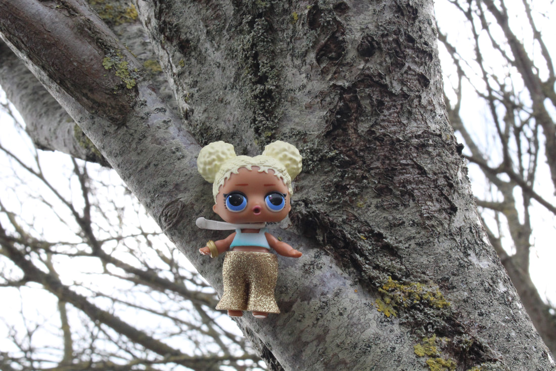
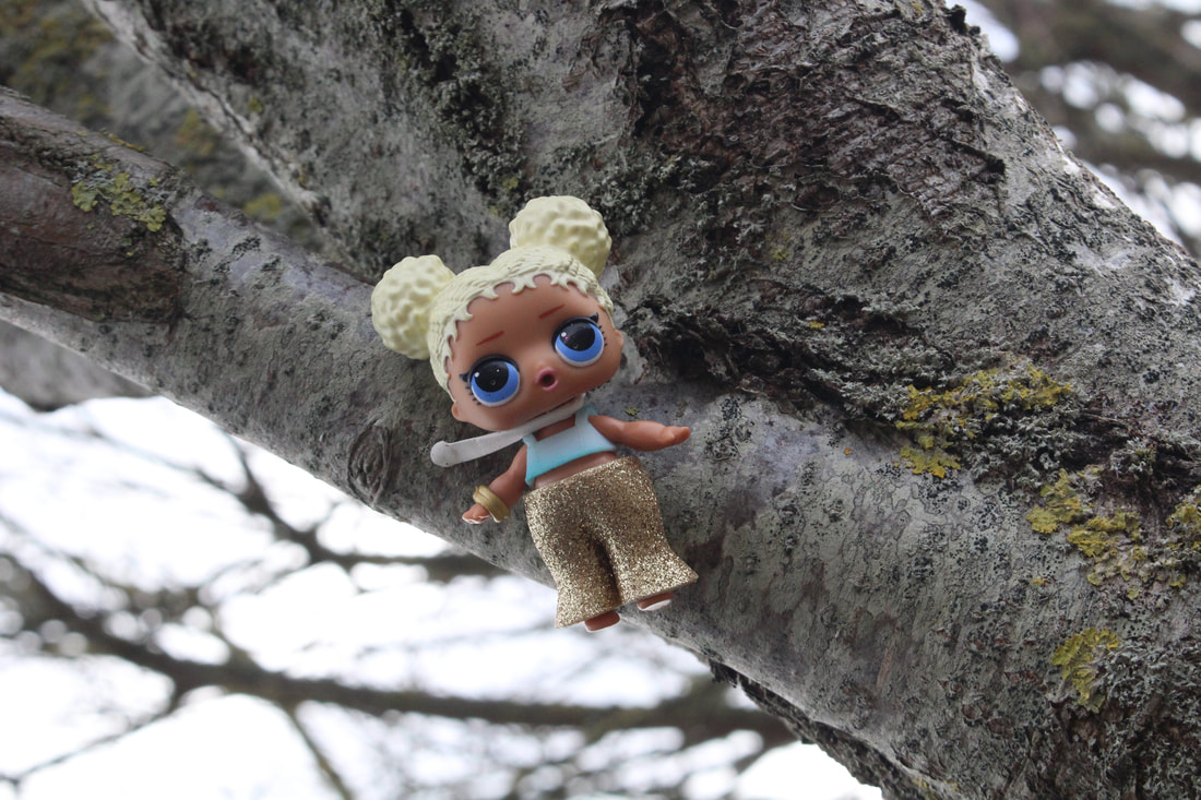
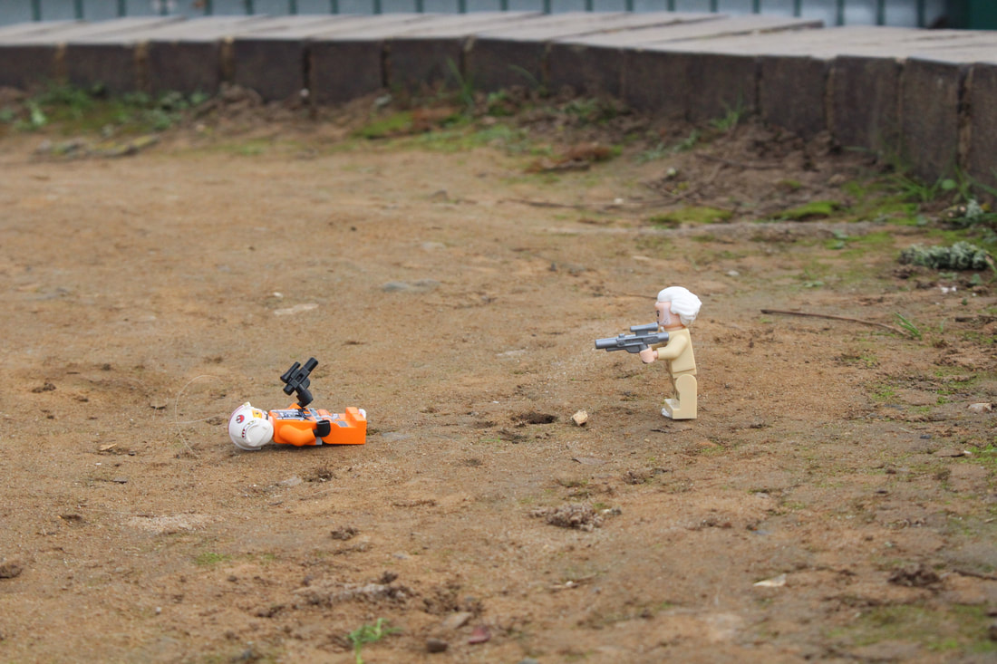
To conclude, overall within this shoot i believe that this is weaker than my original slinkachu shoot, as i think that the props do not work as well as having smaller props like lego. However, i like the composition of these images and the lighting.
EYE BOMBING:

Eye bombing is - The idea is sticking removable sticky googly eyes onto objects such as pipes and fencing or cups. To almost seem human like.
- Eye Bombing rules:
- No stickers or paint
- Don't use humans (eyes on eyes)
- Has to be in a public space
- Place on a inanimate object
- Smile!

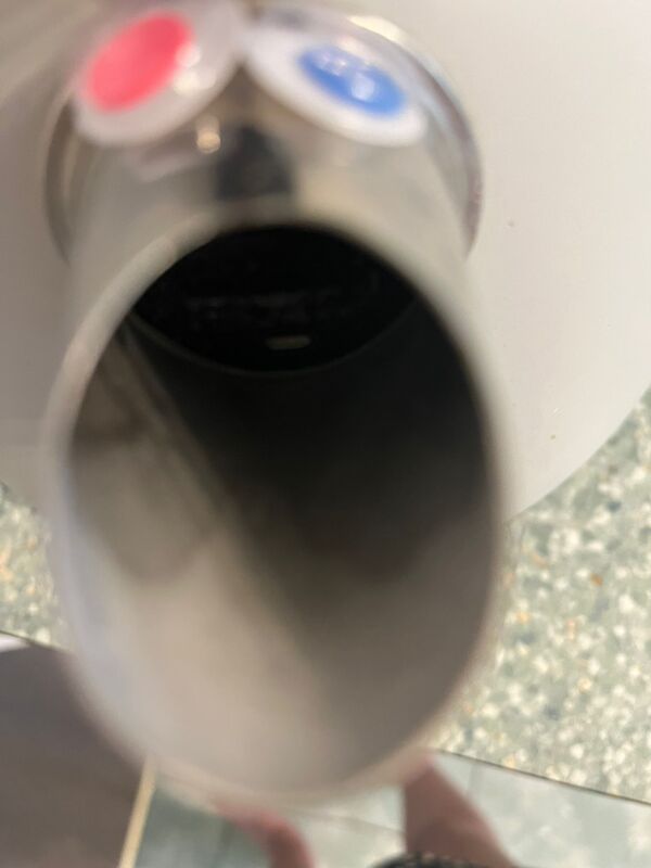
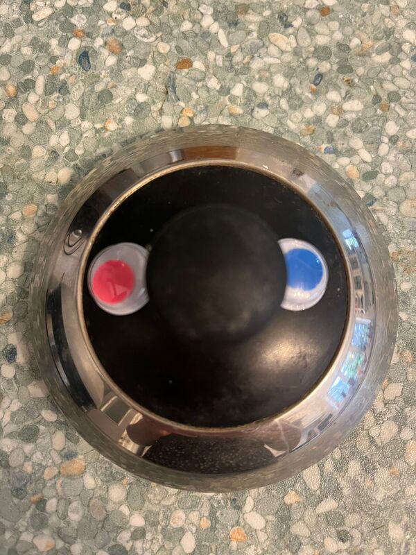
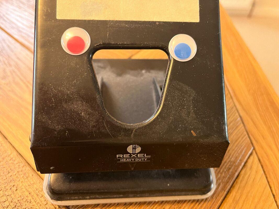
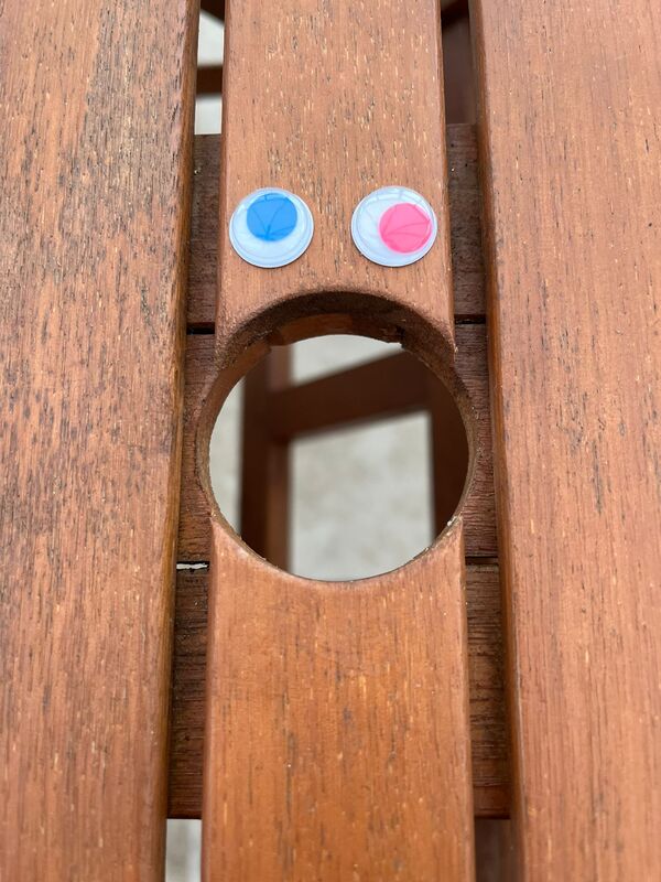
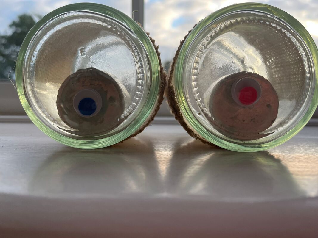
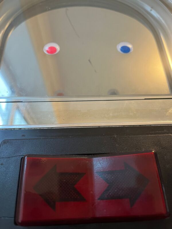
This is the image I have chosen to write about in detail :
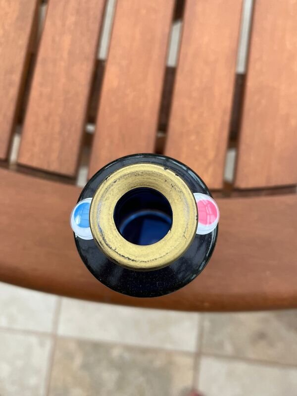
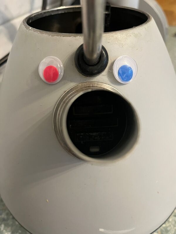
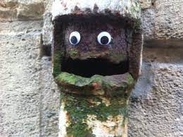
The thing I like about this image is that the eyes are big and rounded, and the hole of the cup (where people would drink from) is the mouth. I like the slanted lid as it gives diminution to the cup looking human like. This image is of a coffee cup looking like a face, with the googly eyes and the hole to drink from a mouth. The composition style this photographer has used could be symmetry this photographer has also used a composition style we call 'filling the frame.'
I don't think this photographer has used any filters such as 'the raw camera filter', or any edits to this image. This image will influence me taking my own Eye Bombing photo shoot due to the composition and the filling of the frame. The same visuals I will use will be the googly eyes and the aim to make a face to look human like out of inanimate objects.
Throughout this course we have been given a chance to add on coursework we may have missed. For me, I thought that it would be good to revisit some of my writing a year later and date it here, which will further show my improvement within this course. However, on saying this, i am going to leave my year ten coursework due to the reasoning my writing has improved. So below is a short write up continuing from the reasons i like this image.
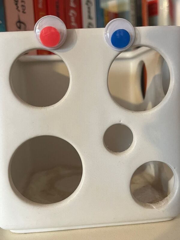
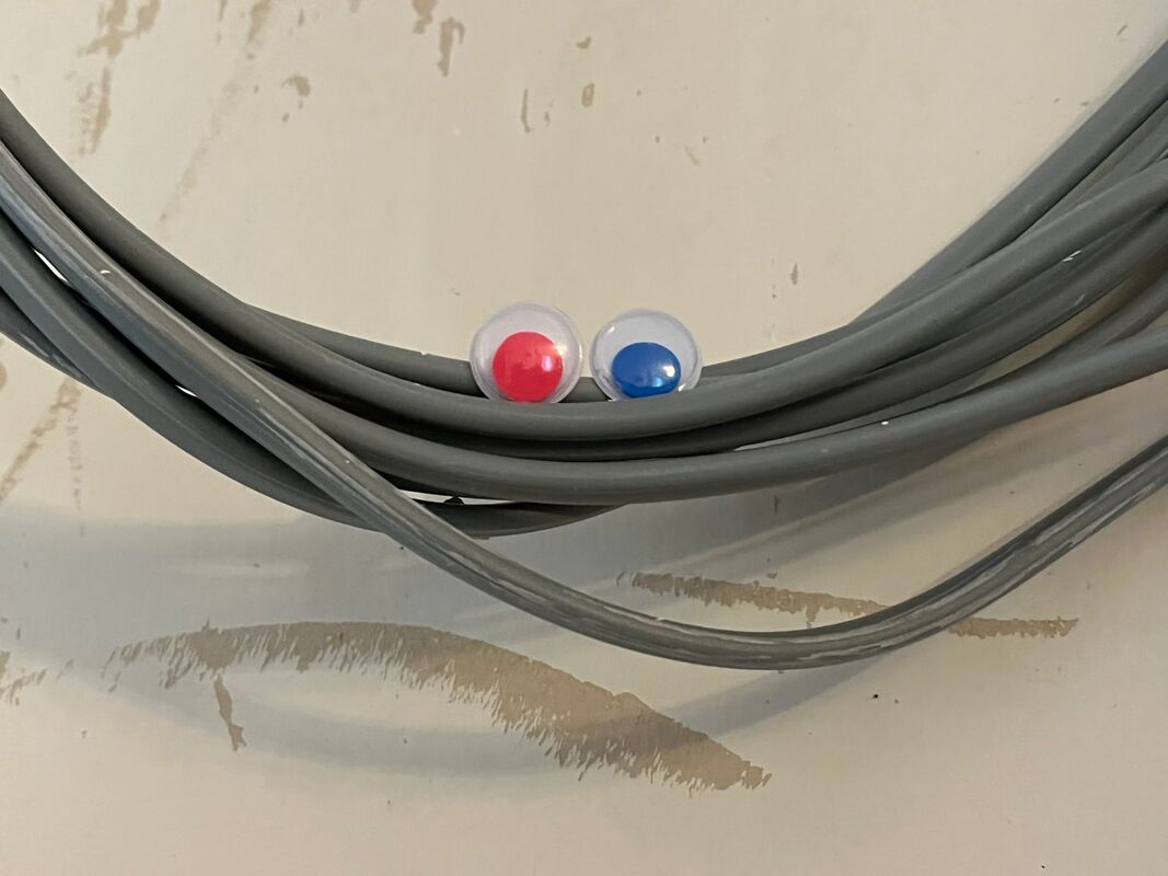
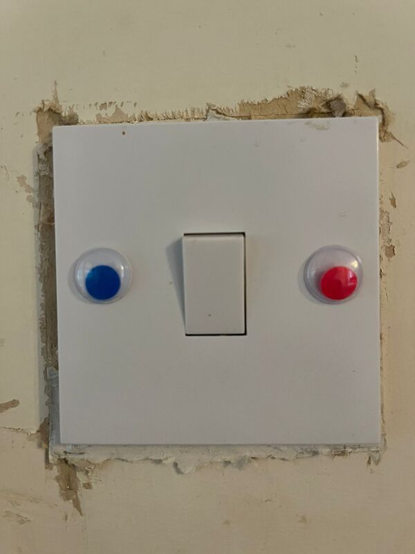
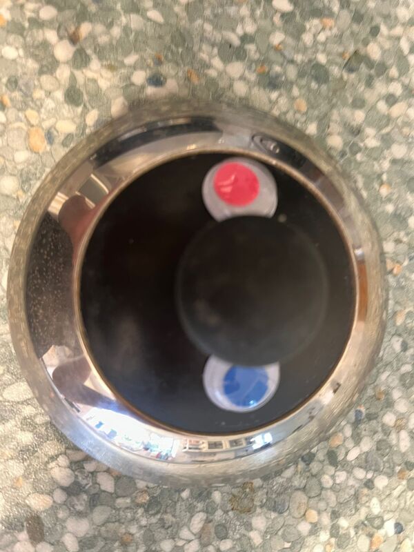
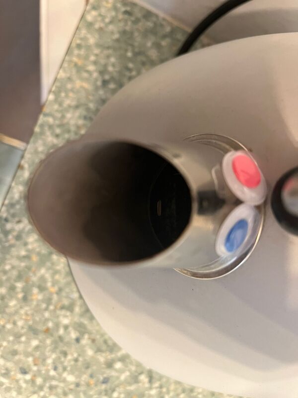
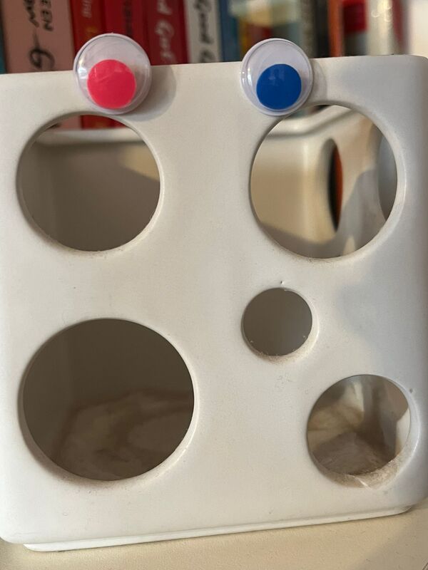
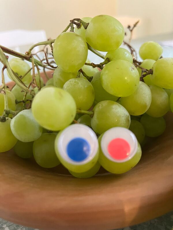
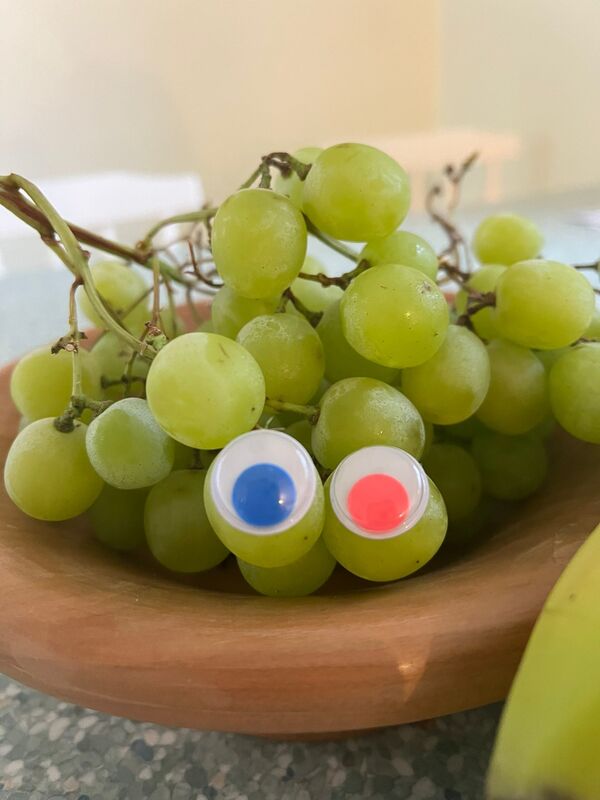
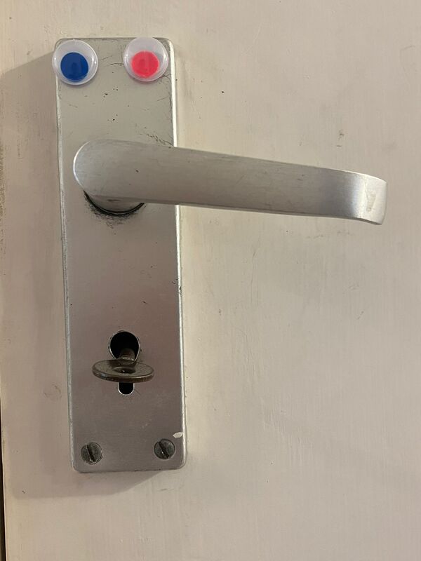
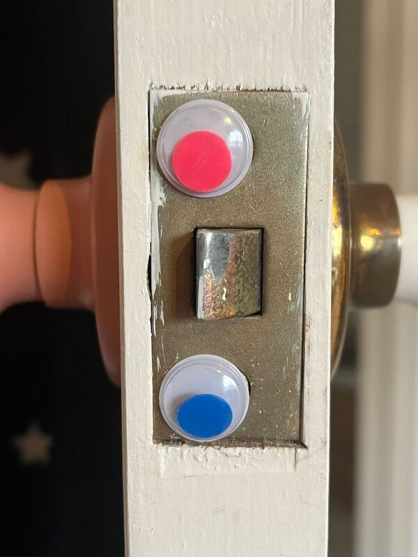
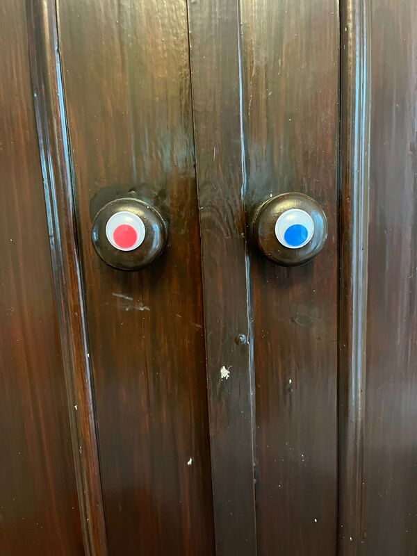
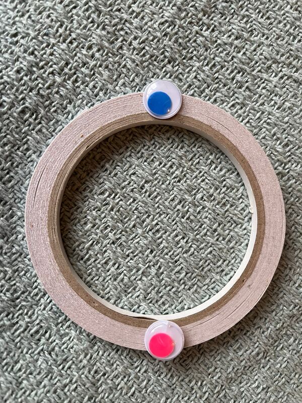
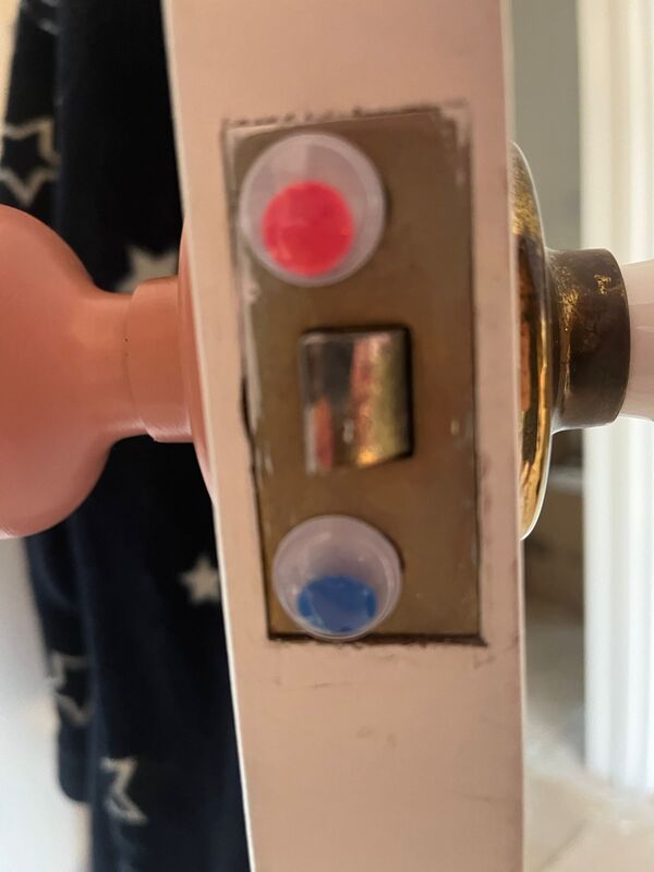
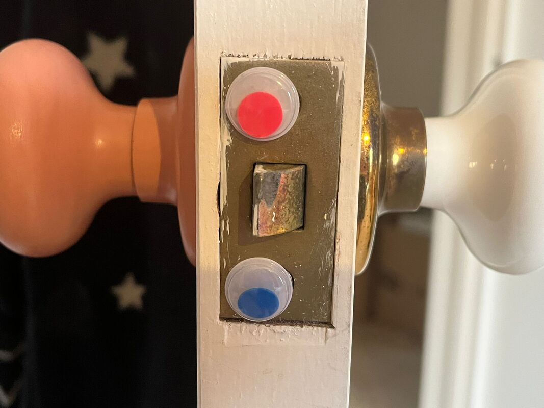
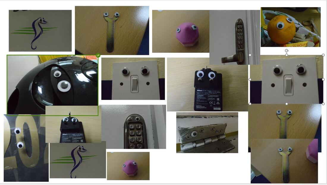
I like these image as they use a wide range of angles and perspectives alongside using multiple shapes and colours to create visually funny images by using many different household objects. This photo follows the rule of three composition technique, however the focus within this image could be better. I think this could capture the audience as it is a funny image using an everday item. Just like this image and the ones above i am going to differentiate my use of focus, composition set up, aperture and lighting to create more successful images.
The thing I like about this image is that the eyes are big and rounded, and the hole of the cup (where people would drink from) is the mouth. I like the slanted lid as it gives diminution to the cup looking human like. This image is of a coffee cup looking like a face, with the googly eyes and the hole to drink from a mouth. The composition style this photographer has used could be symmetry this photographer has also used a composition style we call 'filling the frame.'
I don't think this photographer has used any filters such as 'the raw camera filter', or any edits to this image. This image will influence me taking my own Eye Bombing photo shoot due to the composition and the filling of the frame. The same visuals I will use will be the googly eyes and the aim to make a face to look human like out of inanimate objects.
Throughout this course we have been given a chance to add on coursework we may have missed. For me, I thought that it would be good to revisit some of my writing a year later and date it here, which will further show my improvement within this course. However, on saying this, i am going to leave my year ten coursework due to the reasoning my writing has improved. So below is a short write up continuing from the reasons i like this image.
I like these image as they use a wide range of angles and perspectives alongside using multiple shapes and colours to create visually funny images by using many different household objects. This photo follows the rule of three composition technique, however the focus within this image could be better. I think this could capture the audience as it is a funny image using an everday item. Just like this image and the ones above i am going to differentiate my use of focus, composition set up, aperture and lighting to create more successful images.
EYE BOMING (RETAKE AS LOST HALF THE PHOTOS LAST SESSION)